Monday, October 20, 2014
Axioms of Web Design
Axioms of web design:
Business/Communication Objectives
We are visual animals (WAVA) is a blog designed to spotlight emerging visual artists. With that objective in mind, I believe that they have designed a web site that would appeal to those who are interested in art and those that would be proud to have their work displayed on this site.
Strong Grid
They use a consistant grid (white space) when showing the artist works of art throughout the interview.
The Lower Right
This section of the web design is not used effectively on this blog. It may be because of the visual aspect of the page.
Continuity
This page creates continuity by setting up a interveiw page for each artist and each page is similar in structure. The interveiw questions for each artist follow the same basic pattern, varying only because the art channels (photos vs scuptures) are different.
Intuitiveness/Affordance
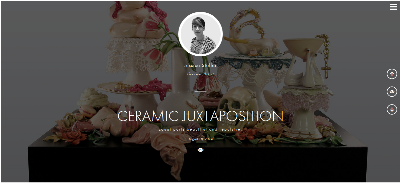
I thought this site was very intuitive. While it did not have indexes or tabs, I had no trouble figuring out how to navigate the site. It had the thee horizontal lines which indicated "click here for more information about this site" then it gave an "about" and an index of artist. It also included the important X so you could close out areas that you were done with. There were up and down arrows that let you know you could move in those directions as well as an eye icon "click here to enter" which was OK, but I did not really think it was needed because you could just click on the photo, the artist name, or title of the work and it took you to the same place.
Greatest Contrast:
The website does a good job here. The works of art are the background for the artist page, but faded out, you can see them enough for a tease. The area of focus is the artist - which is a photo of the artist and surrounded by a white circle and becomes what the eye focuses on.
Good Looking means Easy
This web site looks very good and makes it easy to navigate.
Converts to Aspect Ratios
The site failed on the SMART phone that I tried. I got a blank page - nada - nothing. Guess they have some work to do if they want to show content on the mobile devises.
Subscribe to:
Post Comments (Atom)

No comments:
Post a Comment