Tuesday, December 9, 2014

Collaborative Design


Magazine Ad by: Amy Cotton

Our product, KlariNova, is a barrel with a pickup device preinstalled. It is intended to bridge acoustic and electric instruments and create ease while playing. Using the KlariNova, your clarinets deep dark rich tone is brought out, just like your friends in the rhythm section.

With the KlariNova, it's your time to be heard. Never again will someone tell you, "I saw your fingers moving, but I could not hear a thing." The power is in your hands.

The KlariNova is the genius of Josh Kaneversky who created a working prototype. He originally saw this idea on a YouTube video from Malaysia and had difficulty finding the product here in the United States - so he created his own!


Target Audience


● 25-35 years old
● Professional Jazz Style Musicians

 Persona

Anne is 27, and has just completed her Bachelors degree in her hometown. Anne is single and has recently moved to Seattle to begin work on her Masters program. She started playing the clarinet at the age of 8. She played in the concert band during her high school and undergraduate career. Since she was living in the same city with the same crowd, she felt as though she was stuck with the same old tunes. She is now ready to explore her new city of residence by expanding the possibilities of her talent and make her clarinet sing a whole new tune. Looking to fit into the Seattle grunge music scene, Anne feels left out because she can only play the clarinet and has no way to fit into non-classical style of music.
 

George is 30 and is lawyer at a prestigious law firm in New York City. He is married with 2 kids, ages 5 and 3. George is a professional jazz musician, and together with three of his college friends, they have a combo called “American Beauty”. They play almost every weekend at local coffee shops and jazz clubs. Due to his busy schedule and juggling a career, family and the fact he lives in New York, George is looking for equipment that is easy to move, fast to set up, and easily stored to protect his equipment from his kids.

Mark is 34, single, and owns his own real estate business in Atlanta. He is a member of a band called “3560”. Its popularity has allowed them to play up and down the eastern United States. Mark plays many solos on the clarinet and has experienced difficulty with the sound getting lost in the background due to his bandmates only using electric instruments because of cost and portability. Mark is tired of lugging around microphones, stands and chords with him and is looking for a more convenient way to create the needed volume.


Communication Objectives

● Bridge the gap between acoustic and electric sound
● Ease and portability
● Small Item – Big Sound – Infinite possibilities


 The Print Ad

My artifact is the print ad. To meet our communication objectives we needed to show the audience the function of the KlariNova - why they needed to have one.

This ad is meant to appeal to psychological side of the musician and their need "to stand out" and finally be heard. Culturally and socially clarinet players get lost in the background. Their instrument is difficult and cumbersome to mic and they lose out on solo pieces.

The focal plane in this photo is the front clarinet, the one that has the KlariNova attached. Using the rule of thirds, the entire KlariNova clarinet sits on the left cross points of the grid. In addition, the KlariNova itself is at an intersection point, and the graphic words are on the "thirds-line" as well. The index vector moves the eye from the front instrument, to the next and right out of the frame to the right. If I were to re-shoot this photo, I would put the piano at more of an angle to capture the diagonal rule and make the photo a bit more interesting. It seems so obvious, I don't know why it did not occur to me when I was actually taking the photo.

I created contrast by using figure ground relationship, position, size and color: the KlariNova clarinet (the figure) is in the front, it appears larger than the other instruments, is in focus and has more intensity than the other instruments which fade in the background.

The vertical line of the KlariNova clarinet, suggests a rising above the limitations previously known by the clarinet player.

The law of closure is evident in the KlariNova clarinet, the piano and saxophone. They all continue outside the photo but you don't need to see them to know they are there.

The logo creates brand recognition and the web address, moves people to a place where they can find out more information and purchase the product. They are necessary bits of information, yet small so they do not take away from the emotional appeal of the ad.


This design was inspired by Professor Young, who in addition to talking me through design ideas - showed me how to work the settings on my camera to achieve the desired effect.  


Our Team:


Emily Bills: Brochure
Brad Collins: Comerical
Amy Cotton: Print Design
Josh Kaneversky: Inventor/Packaging
Clint Post: Web

Thursday, November 13, 2014

Mise-en-Scene Presentations

the-italian-job-movie-in-tamil.jpg

Released in 2003, The Italian Job is an American remake of the 1969 British film of the same name, and is about a team of thieves who plan to steal gold from a former associate who double-crossed them.

It had an estimated budget of 60 million dollars.

Most of the film was shot on location in Venice, Italy and Los Angeles. CA, where canals and streets, respectively, were temporarily shut down during principal photography.

Crew Credits:
Director: F. Gary Gray (Group: Brad Collins)
Production Designer: Charles Wood (Amy Cotton)
Cinematography: Wally Pfister (Kelli Cosby)
Art Director: Mark Zuelzke/Doug Meerdink (Travis Terry)


The scene we choose for our Mise-en presentation is "into the Subway"


Visual Communication Objectives:
It is a race against time...are they going to make it?

This scene sets up the physical context by showing the cars racing down the street and then entering the subway station and then the subway tunnel.

The psychological context is all about the race against time, building the viewers anticipation. It begins with actor in the control booth saying "you have 90 seconds" throughout the clip he continues to counts down, "30 sec." "15 sec.", another actor in one of the cars says "go,go,go". Also speed of the cars racing down the stairs, through the crowds with people jumping out of the way and then racing the actual train. The end is classic, not only do they beat the train, but the way the actor in the control booth says STOP, right there (and laughs), the camera shows just him pushing a button on his computer, then the train stops perfectly lined up with the wall, it ends that adrenalin rush and you go - wow, they made it!

Social context - cars do not belong on sidewalks or in subways which is demonstrated by the driver of the train and couple who are passengers on the train looking at the mini coopers racing alongside of them on the platform - plus all the people jumping out of the way.


Production Designer: Charles Wood

It was my task to explore the role of production designer.

What does a production designer do?

A production designer is the person responsible for the overall look of a filmed event. Production designers have one of the key creative roles. They work directly with the director and producer to select the settings and style that will visually tell the story.

Mr Wood was educated at the City & Guilds of London Art School with a Degree with Honors in Fine Art Conservation and Restoration. He is fluent in English and French. He has the opportunity to film in Australia, Austria, Canada, Czech Republic, Germany, Ghana, Holland, Ireland, Israel, Italy, Jordan, Mexico, Morocco, Philippines, Thailand, U.A.E., U.S.A., United Kingdom, Canary Islands.

According to IMBD, Mr. Wood's body of work includes the following:

Visual effects (4 credits)
1996 Downdraft (TV Movie) (visual effects designer)
1993 Fearless (visual effects art department: Introvision)
1993 The Fugitive (art director)
1992 Under Siege (visual effects art director - uncredited)

Art department (3 credits)
1995 Josh Kirby... Time Warrior: Chapter 1, Planet of the Dino-Knights (Video) (art director: additional photography)
1994 New Nightmare (draftsman - as Charles J.H. Wood)
1992 Army of Darkness (assistant art director)

Production Designer (21 credits).
2016 Doctor Strange (announced)
2015 Avengers: Age of Ultron (post-production)
2014 Guardians of the Galaxy
2013 Thor: The Dark World
2012 Wrath of the Titans
2010 The A-Team
2008 The Love Guru
2008/I Fool's Gold
2006 Flyboys
2006 Amazing Grace
2005 The Honeymooners
2004 Laws of Attraction
2004 Mindhunters
2003 The Italian Job
2001 Driven
2000 Get Carter (as Charles J.H. Wood)
2000 Geppetto (TV Movie) (as Charles J.H. Wood)
1998 Legionnaire
1997 Mortal Kombat: Annihilation
1997 DãNA (Video)
1994 Twin Sitters


In the completed film, the Mini Coopers drive down the steps of the Hollywood/Highland Station and into the subway tunnel. The clip is only a few seconds in the movie but involved days of shooting.

Before filming, the stair railings had to be removed to accommodate the cars, plus production crew constructed false steps to protect the real ones from the pounding of the Mini Coopers, even though they are small, they are still cars and are very heavy.

The magic of film...rather than ducking into the Hollywood/Highland subway tunnel as it appeared in the movie, the cars were filmed driving down the platform and onto the tracks at 7th/Metro Station because there was more room to maneuver.

If you want to shoot a film using the subway, it can be done - but filming may not interfere with service. Whether you want the light-rail, on the bus, just a bus in the background or at Metro headquarters. Which is why much of the filming particularly on the rail lines occurs at night, after the last train has delivered the last passenger for the day. However, if shooting does not affect service it can happen during the day.

To give you an idea of how much it costs...

Train Station Platform, Mezzanine and/or Escalators AND Control of a Train (Red, Purple, Gold, Blue or Green Line)
$6,000 for minimum of 6 hours
$1,500 for each additional hour
Plus personnel cost


32 Minis were used throughout the shooting

Three electric-powered Mini Coopers, and one Mini Cooper S had to be specially built for the film, since gasoline-powered vehicles are not allowed to operate in L.A.'s subway system.


The subway tunnel is one of the few sets built for this movie.

Scenes were filmed in a hangar in Downey, California, where the first space shuttle was built.


Wednesday, October 22, 2014

Compose Your Frame

The LDS visitors center in St. George, UT.
I picked this location for my photo shoot because the Temple grounds always have beautiful flowers and landscaping, plus the very white buildings add a nice contrast.

In my effort to set up this shot, I used the rule of thirds by placing the rose in lower left intersection of the rule of thirds grid and the visitors center in the upper right intersection of the rule of thirds grid. This shows off the building and the beautiful flowers in the area.

I photographed the walkway on a diagonal to use the diagonal rule. It added interest and movement to the frame. Much better than shooting straight down the walkway, vertically or horizontally. In this frame the walkway appears to continue on to the left.

The graphic vector in this photo is the short white wall which provides a strong contrast from the green grass and moves the eye through to the right of the frame.


Monday, October 20, 2014

Axioms of Web Design


Axioms of web design:

Business/Communication Objectives
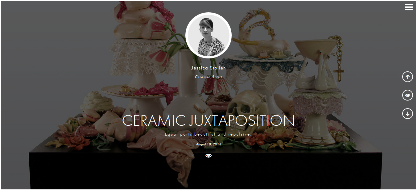
We are visual animals (WAVA) is a blog designed to spotlight emerging visual artists. With that objective in mind, I believe that they have designed a web site that would appeal to those who are interested in art and those that would be proud to have their work displayed on this site.

Strong Grid
They use a consistant grid (white space) when showing the artist works of art throughout the interview.

The Lower Right

This section of the web design is not used effectively on this blog.  It may be because of the visual aspect of the page.

Continuity

This page creates continuity by setting up a interveiw page for each artist and each page is similar in structure. The interveiw questions for each artist follow the same basic pattern, varying only because the art channels (photos vs scuptures) are different.
 

Intuitiveness/Affordance
I thought this site was very intuitive. While it did not have indexes or tabs, I had no trouble figuring out how to navigate the site. It had the thee horizontal lines which indicated "click here for more information about this site" then it gave an "about" and an index of artist. It also included the important X so you could close out areas that you were done with. There were up and down arrows that let you know you could move in those directions as well as an eye icon "click here to enter" which was OK, but I did not really think it was needed because you could just click on the photo, the artist name, or title of the work and it took you to the same place.
 
Greatest Contrast:
The website does a good job here.  The works of art are the background for the artist page, but faded out, you can see them enough for a tease. The area of focus is the artist - which is a photo of the artist and surrounded by a white circle and becomes what the eye focuses on.

Good Looking means Easy

 This web site looks very good and makes it easy to navigate.

Converts to Aspect Ratios 

The site failed on the SMART phone that I tried. I got a blank page - nada - nothing. Guess they have some work to do if they want to show content on the mobile devises.

Tuesday, September 23, 2014

Design Evaluation


To prepare for this assignment I visited my local Lin's Market and then wandered over to the Walgreen's Drug store across the street.  I was looking for inspiration.  What catches my eye or what do I buy and why.  Do I buy it simply because of the packaging? I settled on comparing a couple mint products.


Altoids
 
Contextually, Altoids hits it out of the park psychologically (strong, confidant), culturally (historic) and socially (fresh breath). Altoids have a lasting quality to the packaging.  According to their web site, Altoids have been around since the turn of the 19th century and were originally marketed for the medicinal purposes of calming the stomach. The tin container, inside paper lining and overall design gives a feel of an old time pharmacy. 
  
 The container is made of tin plating and is one of the most recyclable materials in manufacturing. 


It also a great way to store buttons, paper clips, pins, screws, etc.


The container itself is aesthetically pleasing.  Rectangular in shape and the label is embossed onto the tin. The contrast of the name "Altoids" is not only black on white but the letters and outside edge of the design are raised giving the cover texture. It has simple, clean lines. The name "Altoids" and the "flavor" are in black which draws the eye and gives the reader the information at a glance.

I find the law of similarity in the color. My eyes group the colors together, first black, then the "color" then the gold which has information, but is not as important. A interesting note, each flavor has a different "color" and that color is used throughout the design.


Icebreakers
The container of the Icebreakers is less than impressive.  It is round, plastic container with a colored base and white lid, plus it has a stick on paper label. Perhaps the goal was to make it appear like a large mint. 

When I look at this label, my first impression is it is too busy, so I asked myself why? More than anything, I think they used too many different kinds of fonts and did not use color well.

The main lettering is a block font, done with white letters and silver/black outline. My eyes don't know where to go. Plus there are all these stars in silver foil that are supposed to represent the flavor crystals, but I think they are a bit distracting.

There is a line in the design of the label from the top of the I then it uses the law of closure and swoops down to the bottom.  It gives the impression of a circle. This gives movement to the label but may also be one of the reasons my initial reaction is that it is too busy.


Going for a fun appeal, the container opens with a "to share" (large opening) or a "not to share" (small opening) option. Unfortunately on the package that I bought, the label was put on the opposite way. 


Monday, September 15, 2014

Gestalt in Architecture


Law of Similarity
I thought the fountain was a good example of similarity because when you look at it you see an entire fountain but it actually many similar shapes put together.


These round columns give the appearance of a straight line.


Law of Proximity
Here these shapes are all the same and placed close together so your eye groups them all together.

Law of Pragnanz 
This photo is a reflection of the entrance of the Eccles Art building.  It shows pragnanz because the windows are reduced to their simplest form of rectangles.

Law of Continuity
If you look at the doorway, your eye moves continuously from side of the arch to the other even though there is a space.


Law of Closure
Well this in not actually architecture...but even though you only see part of the piano and the young lady, you know the rest is there.

Here is a photo that I thought contained several of the principles.


Tuesday, September 9, 2014

Contrast, Balance, Harmony


Contextual Analysis:
This photo really spoke to me from a psychological standpoint. I love animals of all shapes and sizes, but to see something so small created an AHHH moment.  Typically I don't think of turtles as being so small except when they are babies and even then I think they would be larger than a raspberry.

Contrast: This photo does a good job showing many contrast.  The biggest is the size of the turtle compared to a raspberry. Then it uses color to make the raspberry pop out and the rest of the colors blend together. The texture of the rocks is pretty incredibleBased on the size of the raspberry and turtle, the rocks have to be pretty small, but every shape and dimension shows up creating a very rocky looking soil. The turtles shell and skin has rough and smooth looking texture and the claws look very sharp.

Harmony: The rule of thirds is in the color.  The raspberry being on the left of the frame and the only intense color.

Balance: The photo is asymmetrical because the raspberry and turtle are not centered in the photo.


Visceral Response


When I have the opportunity to view paintings or photos I am always drawn to pictures of trees with a pathway and some light shining through. In my search for that great piece of art I found the paintings of Leonid Afremov.  His paintings are done with a palette knife and oils and are quite unique.  They are very colorful and distinctive. While I find many of his paintings intriguing

I picked October in the Forest to share with you. This particular painting gives me a feeling of peace and serenity and renewal.


October in the Forest - By Leonid Afremov

While his art is beautiful and makes a statement all on it's own Afremov's personal story is inspiring as well.  Born on 12 July 1955 in Vitebsk, Belarus, then former USSR. Afremov was raised in a traditional Jewish family and spoke Yiddish and practiced their religious traditions at home during a time when anti-semitism in the government was high and their family risked imprisonment. He lived through the Chernobyl disaster in 1986 which was only a few hundred kilometers from his town and his 2 year old son was affected by the radiation.  In 1990, he migrated to Israel in hopes for a better life free of persecution.  However, he did not find it because his family was persecuted for being Russian. 

In 2002, he moved to the United States and then in 2010 he moved to moved to Playa del Carmen, a popular resort town near Cancun. Due to many of the bad experiences he has had with galleries, Afremov prefers to sell his paintings directly to collectors.  

Design Influences
Line: The lines in the path create depth and pull you into the picture. They also gives you a sense of continuation, you can just keep walking down the path. The vertical lines (trees) give you the sense of largeness, they continue up to the sky and out of the frame.

Shape: While this is a two dimensional painting have only height and width, the lines on the path create a sense of depth, drawing you into the painting.

Color: The colors used in this painting are very intense throughout the hue of colors. The value of color indicates where the sun is shining through the trees.

Space: You could argue the negative space is the trees and path and the positive space is the person walking on the path. It creates a very isolated feeling of a person walking down a rainy path, plus the person is less focused . The pathway/lines, as I have already discussed create a the three-dimensional space.

Texture: The artist has a lot of texture in his work, not to create something that really is but more to create a tactile feel to the work.  I believe that because is has so much texture in the painting, you really do feel as though it it raining or just finished raining.